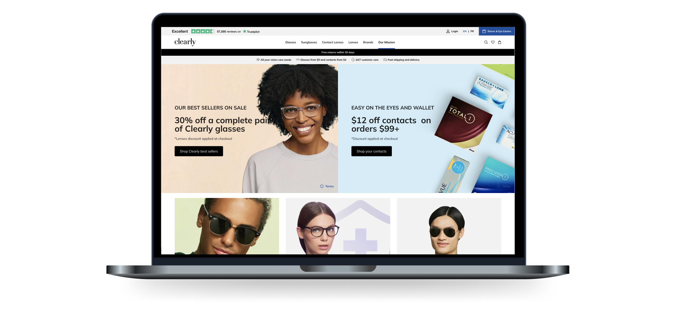
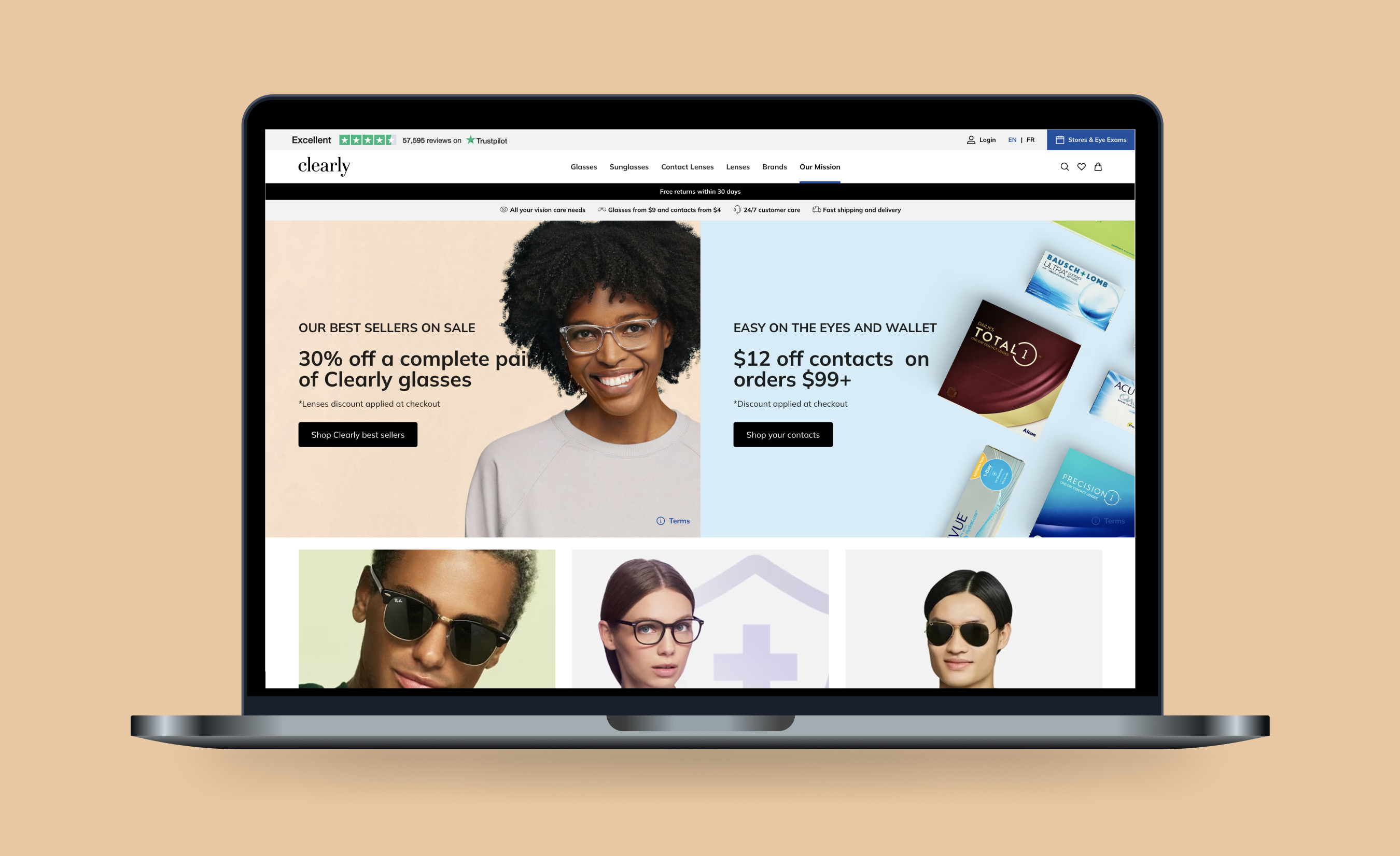
Clearly needed to redesign and migrate its 23-year-old e-commerce website, its first redesign in the company's history, across Canada, Australia, and New Zealand, under a tight timeline and limited resourcing. The scope spanned landing pages, product and category pages, checkout, and the customer account experience, all needing to launch to a consistent standard across three markets at once.
Layered onto the redesign was a separate but related problem: customers were experiencing inconsistent communication in the post-purchase journey. The existing account area lacked the features to let customers resolve order, payment, and account issues on their own, adding pressure to the customer support team and creating friction right when trust mattered most.
I worked as a marketing copywriter within Clearly's content team, reporting to the content manager, on both the website redesign and the account portal workstream. This was a cross-functional effort: alongside fellow writers, I collaborated closely with the content manager, UX/UI designers, developers, an SEO director, and stakeholders across product, customer service, and marketing, each contributing their own area of expertise to a shared timeline.
Content strategy direction and prioritization sat with the content manager and senior stakeholders; my role focused on translating that direction into copy across every touchpoint, from landing pages to microcopy, while feeding back real content gaps and user-facing issues I encountered along the way.
Used plain, persuasive, and intuitive language, from page titles to footer copy, to help visitors make decisions confidently while keeping messaging consistent with Clearly's brand voice across all three markets. Refined microcopy throughout the site, including user flows, CTAs, error messages, modals, forms, and tooltips, for a more consistent, user-friendly interaction from page to page.
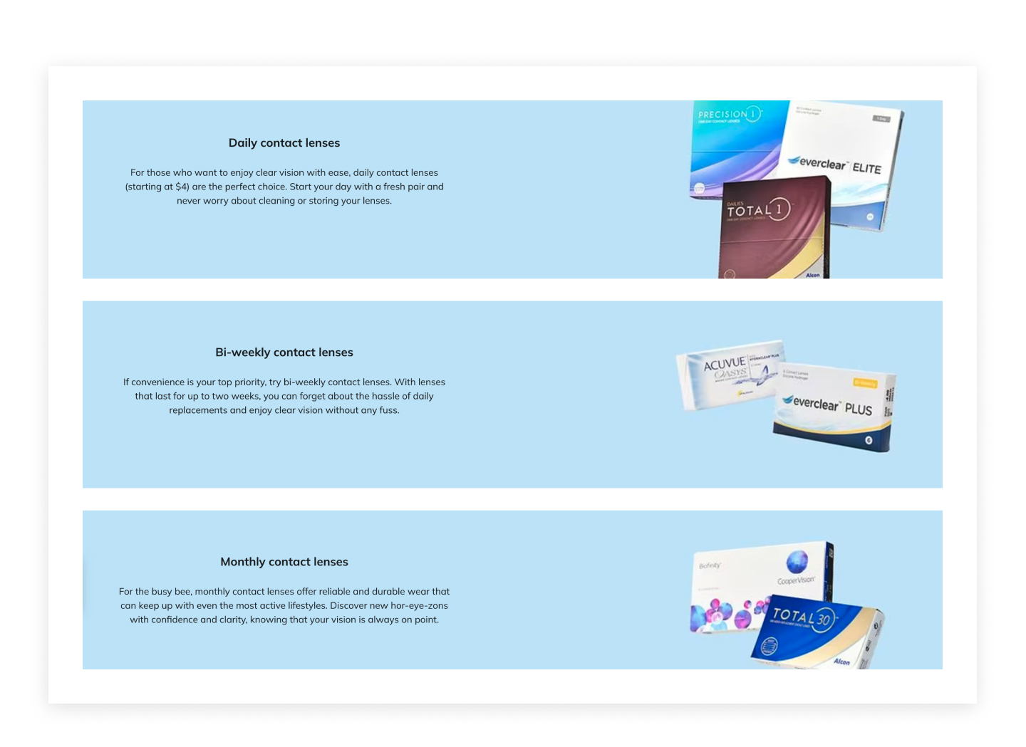
Positive language, a conversational tone, and benefit-driven descriptions on Clearly's contact lens category landing page.
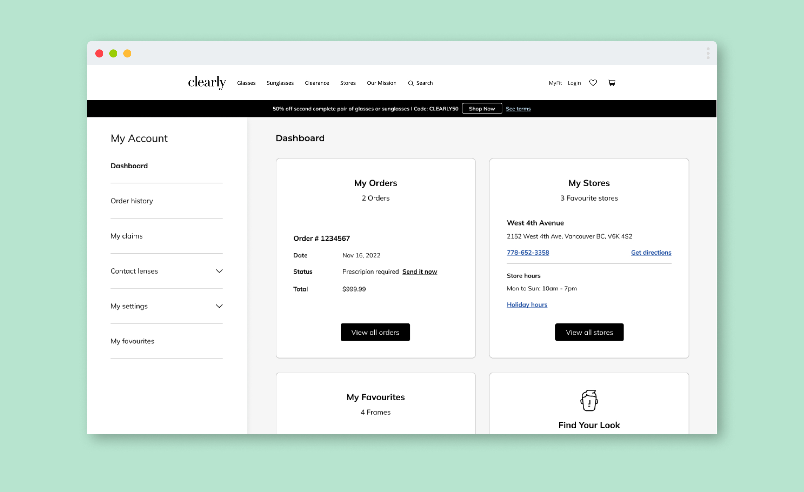
Copy for the full checkout flow, plus account dashboard, sign-in, addresses, payments, and order tracking screens.
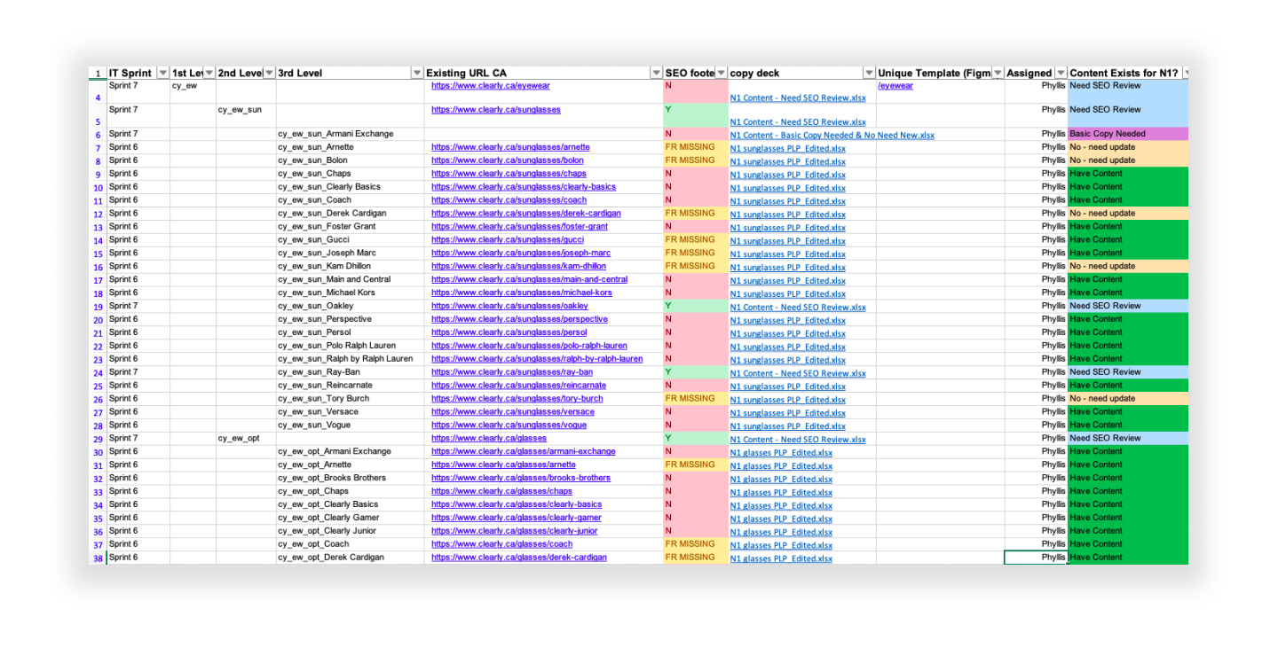
Ahead of the migration, I worked with Clearly's SEO director to translate his technical findings into content for the site's highest-priority landing pages, ensuring they retained search visibility once the new site went live. This was treated as a priority: the writing and collaboration came together in around three days.
The glasses category page moved from 3rd to 1st place on Google within one week of publishing, ahead of the site migration.
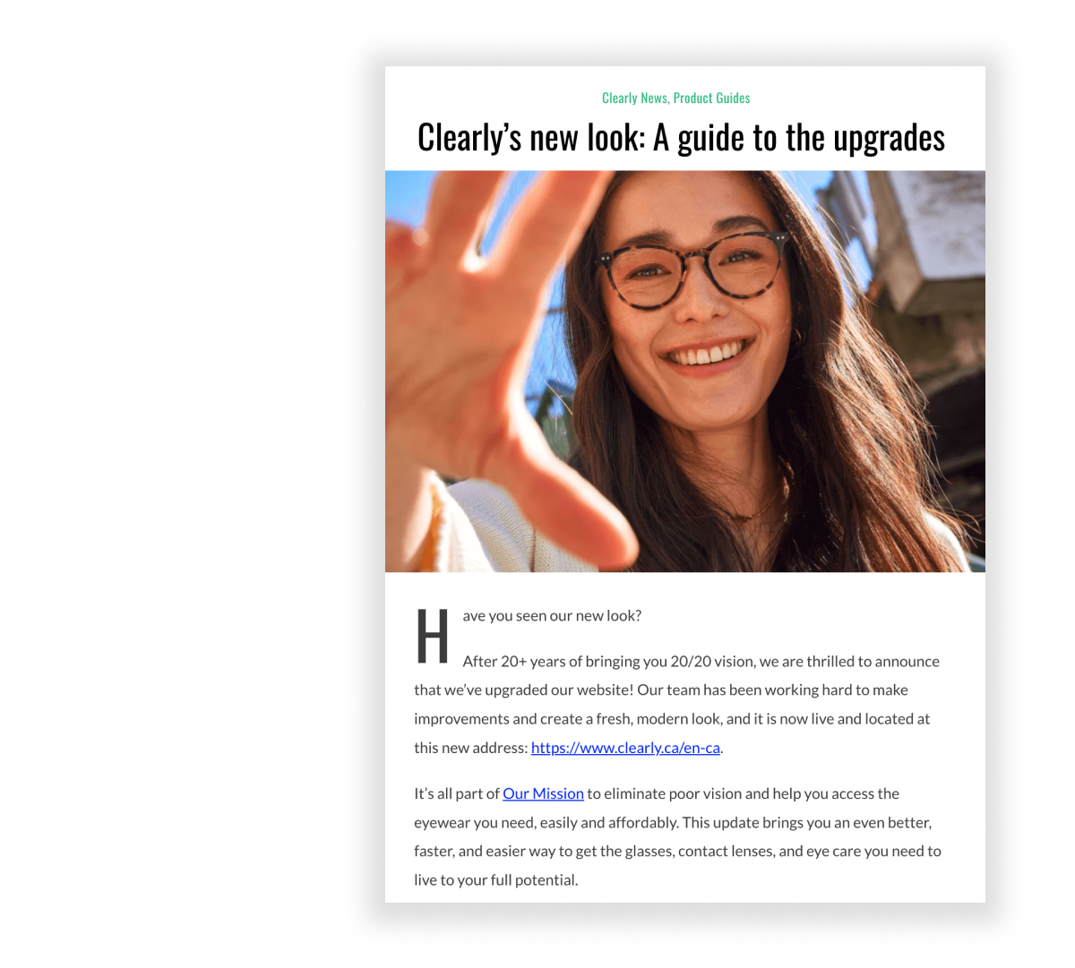
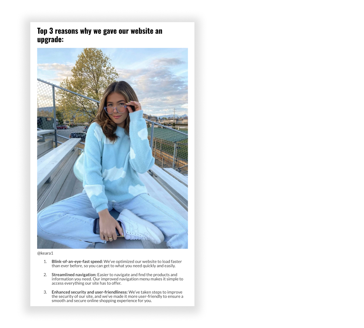
To mark the redesign going live, I wrote the launch announcement blog, "Clearly's New Look: A Guide to the Upgrades," introducing customers to the new site and walking them through key changes (checkout, account, virtual try-on, and more). The post was distributed by the social and email teams as part of the launch, extending its reach beyond the blog itself and turning a single piece of content into a coordinated moment across channels.
Published post: clearly.ca/thelook/using-our-website
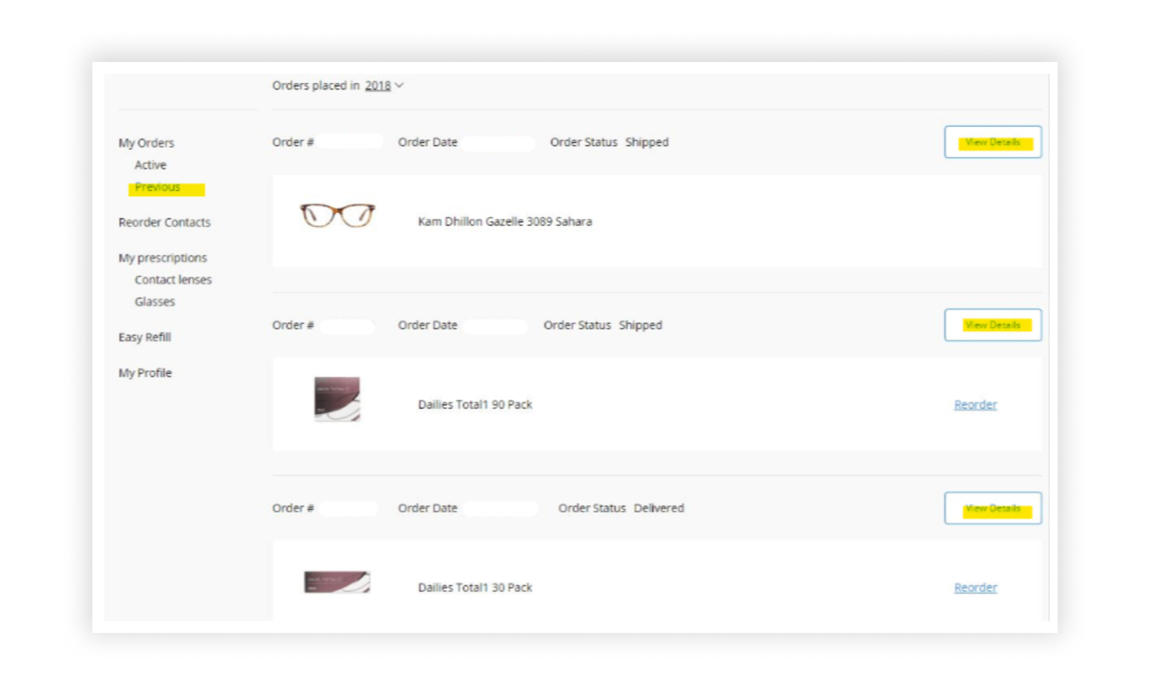
Extended the same content strategy into the post-purchase experience, addressing the specific pain points customers had raised: unclear order status, confusing payment processes, and account changes that left users uncertain whether an action had actually worked.
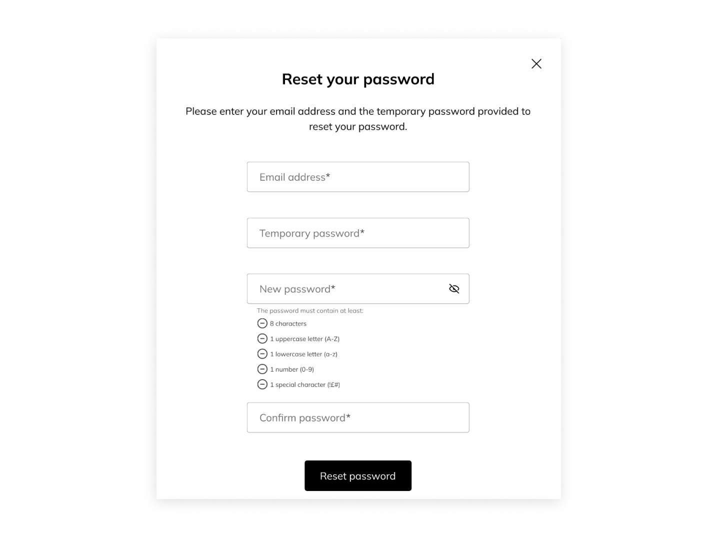
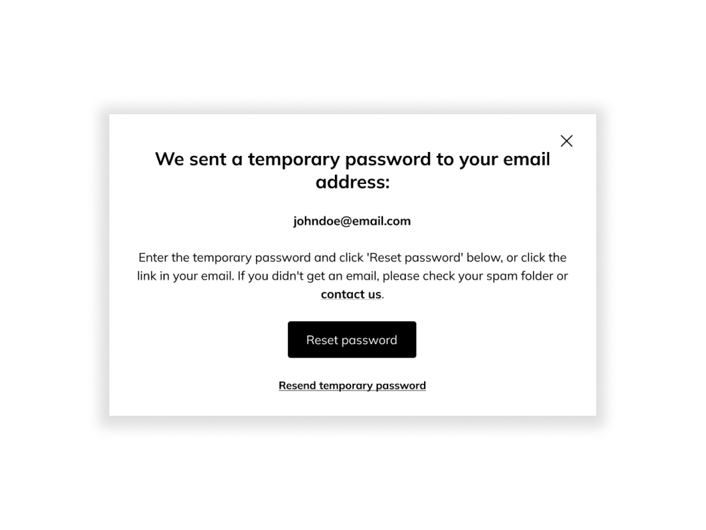
Added clear, highly visible confirmation messages after account changes, resetting a password, updating payment details, changing an address, so users always knew an action had succeeded.
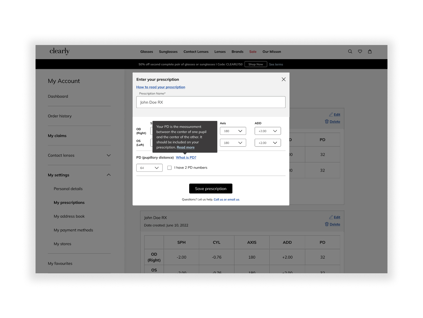
Users were unsure how to locate their "PD" measurement for glasses prescriptions. Rather than a long explanation, a short tooltip with a link to a fuller blog article kept the interface simple without losing helpfulness.
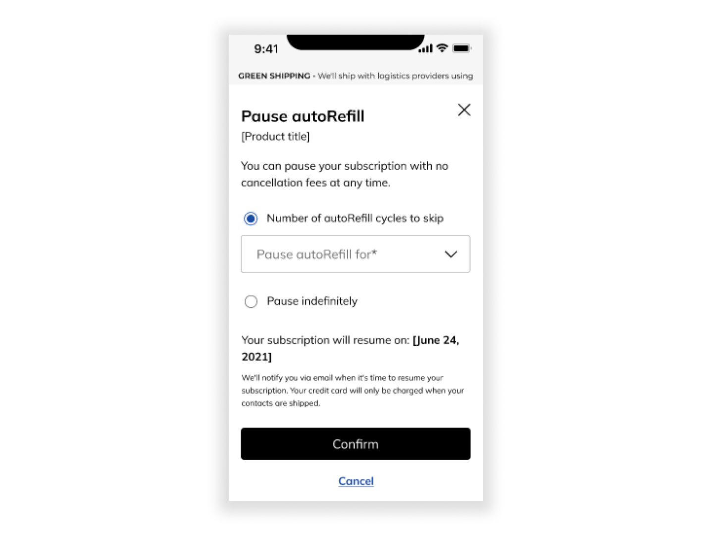
For the contact lens auto-refill feature, added copy letting users choose a pause frequency (from one month to indefinite), plus reassurance that they'd get a reminder email and their card wouldn't be charged unexpectedly.
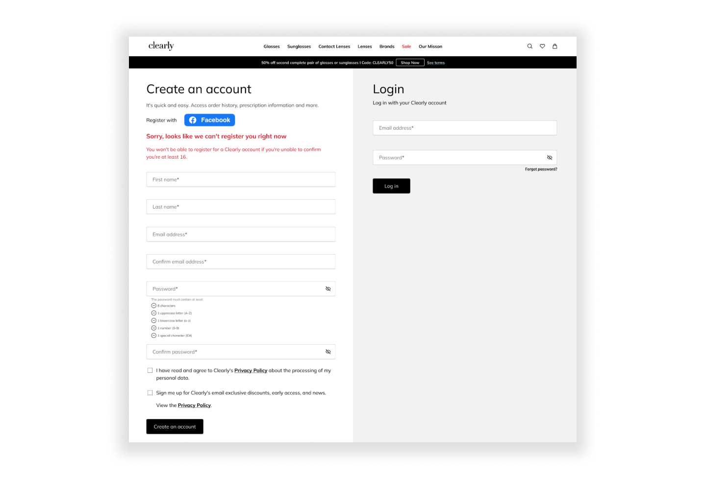
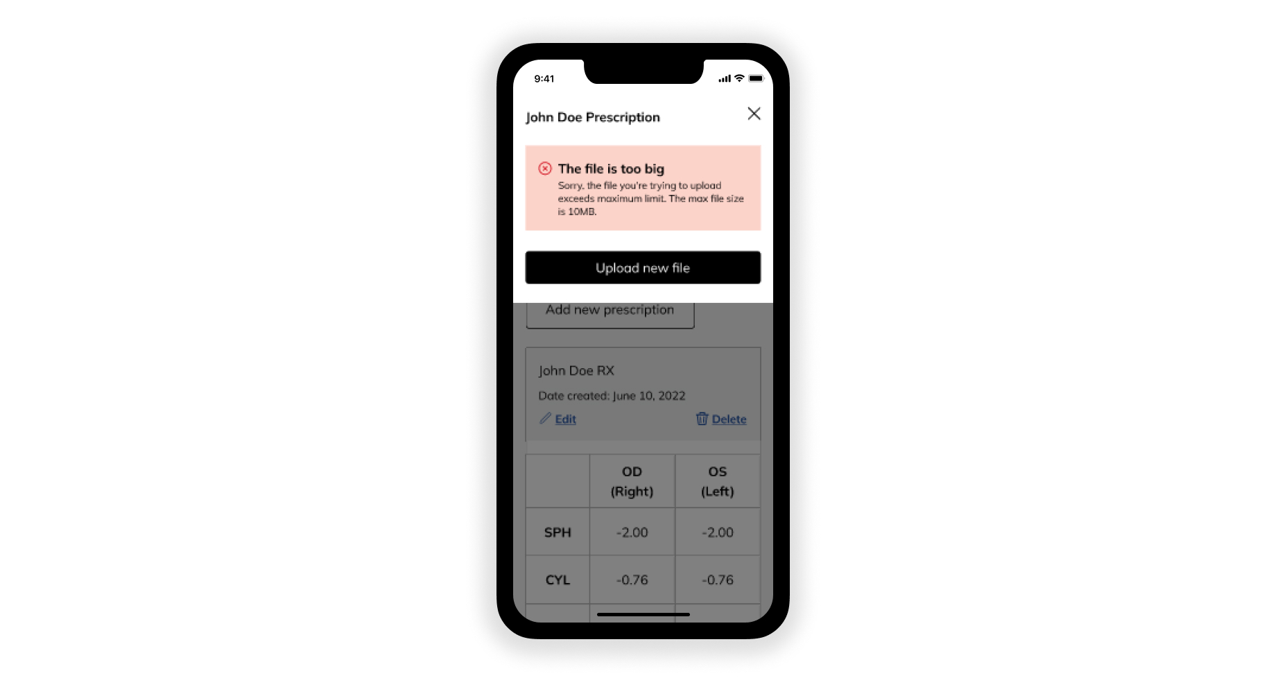
Simplified login and file-upload error messages so users understood exactly what went wrong and how to fix it, rather than being left stuck.
Confirmation Messaging, in action
Tooltip Copy, in action
Subscription Management, in action
Error Messaging, in action
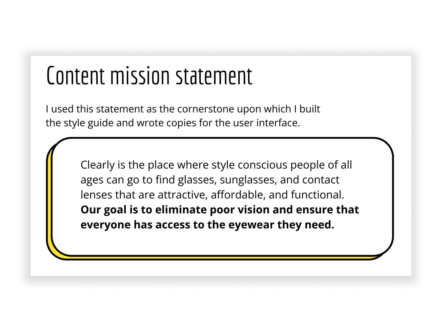
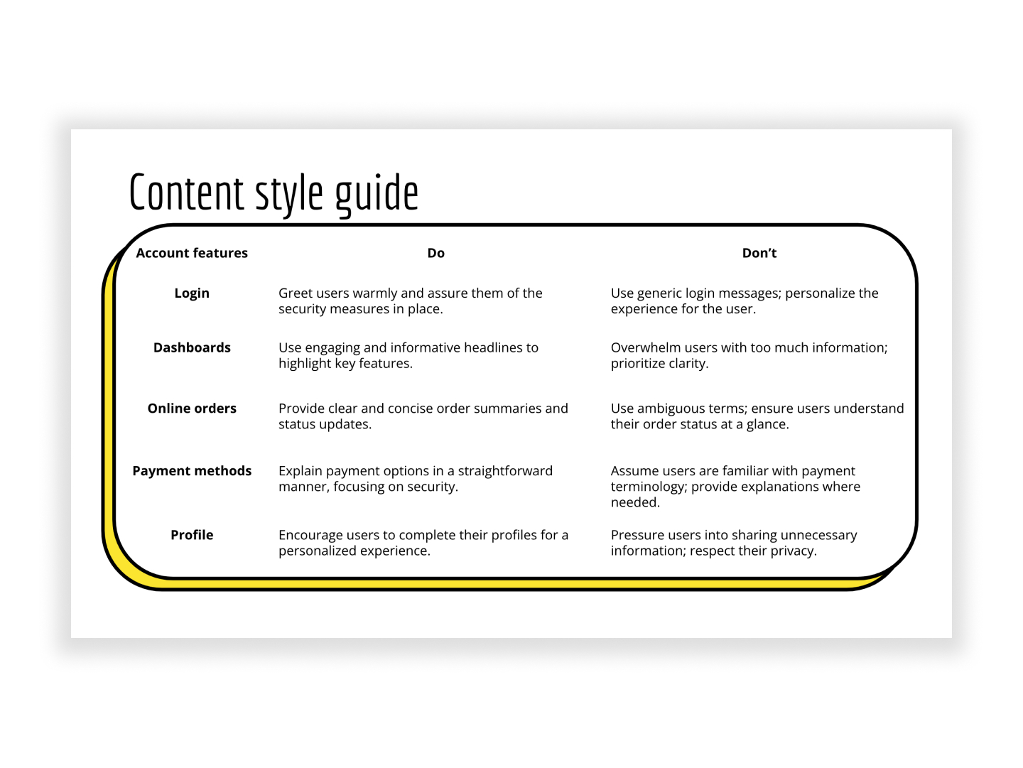
These weren't isolated fixes. Each one came from the same underlying content style guide and brand voice principles established for the redesign, applied consistently down to the smallest interaction.
The redesign was delivered on time and well received by stakeholders across the organization. Priority landing pages retained and improved search visibility through the migration, and the launch was marked by a coordinated content moment reaching customers across blog, social, and email. The account portal gave customers a more consistent, self-service experience for managing orders, payments, and account details, directly addressing the friction points raised in user feedback and easing pressure on customer support.
Working across both workstreams reinforced how content strategy, once set at the top (style guide, tone, structure), has to hold together consistently all the way down to a single tooltip, and how much cross-functional coordination, from SEO to design to customer support, that consistency actually takes.

To review an in-depth selection of my work or to discuss working together, please get in touch: