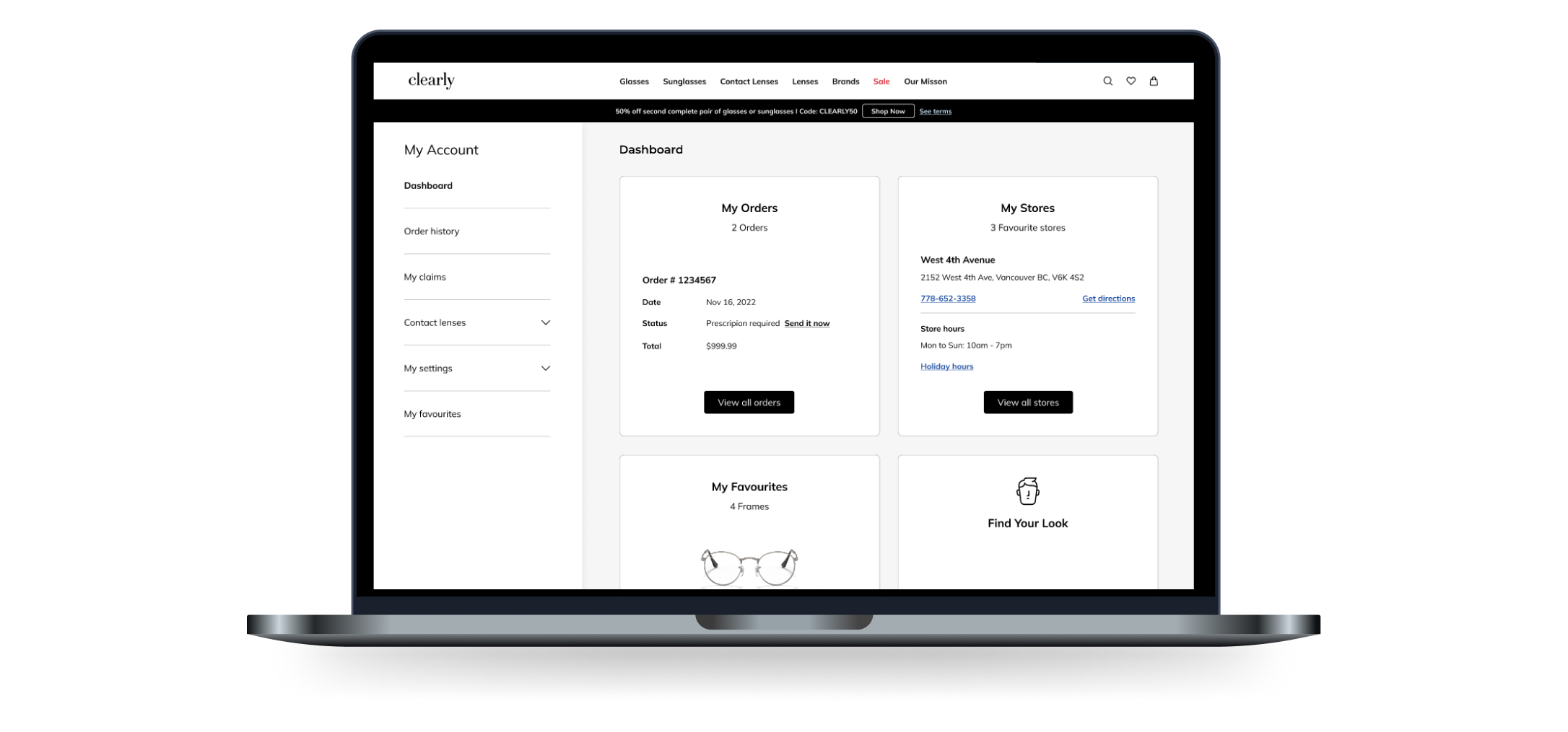


Clearly’s customers experienced inconsistencies in the communication flow post-purchase on the e-commerce website, and insufficient features within the “Account” also made it challenging for users to resolve issues related to orders, payment methods, and account information effectively. Clearly needs to ensure smoother navigation through the account portal.
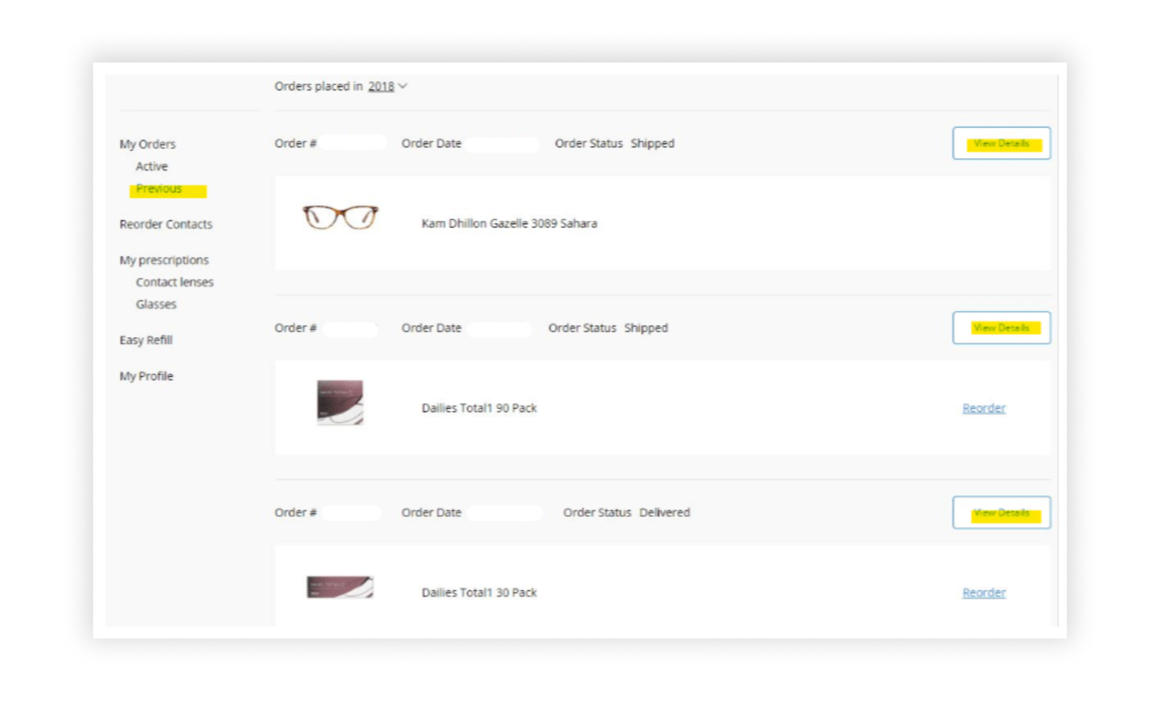
My role as a lead writer was to craft empathetic and solution-oriented copy that would enhance users’ Accounts and Self-service experience in the post-purchase processes.
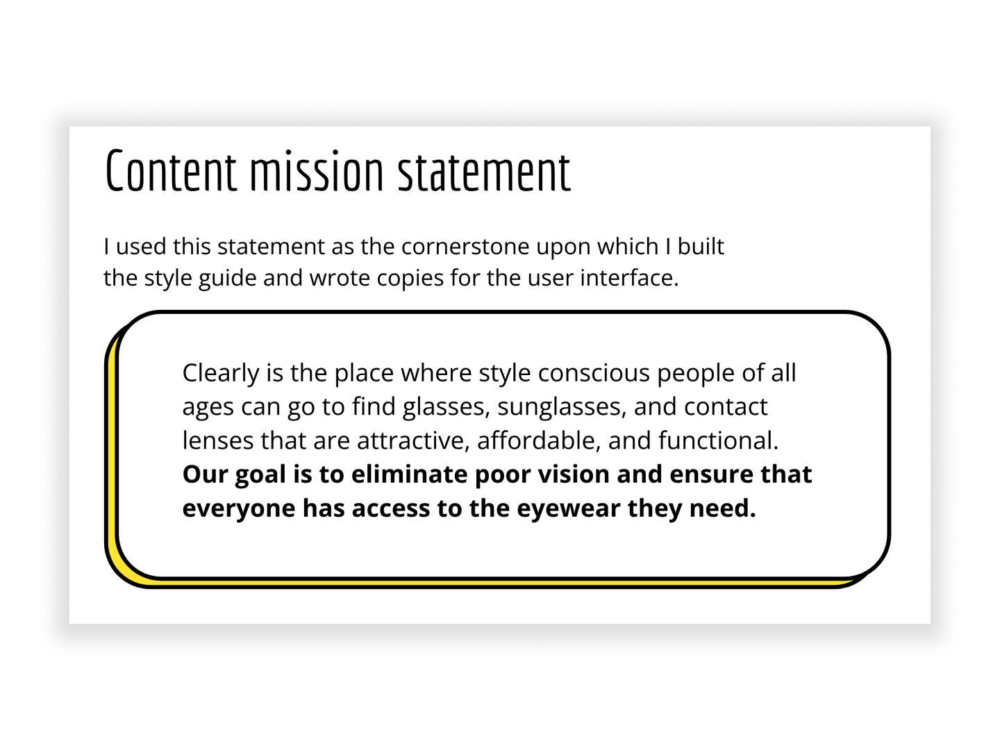
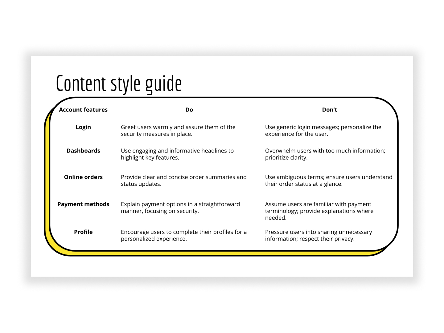
Implemented clear and concise copy to address common post-purchase queries, offering users transparency, understanding, and peace of mind about their order status, payments, and account updates.
Established a consistent and reassuring communication flow regarding payment discrepancies, offering clear guidance on how users can address and resolve payment-related challenges.
Produced copy to empathetically guide users through issue resolution processes and decrease the time it took for users to resolve tasks, ensuring they feel supported and confident every step of the way. Some copies included feedback messages, CTAs, modals, forms, and tooltips.
Provided sufficient confirmation messages after users successfully performed changes within their account. Ensured these messages were highly visible and unambiguous to remove any uncertainty — whether changing an address, resetting a password, updating a payment method, or another change.
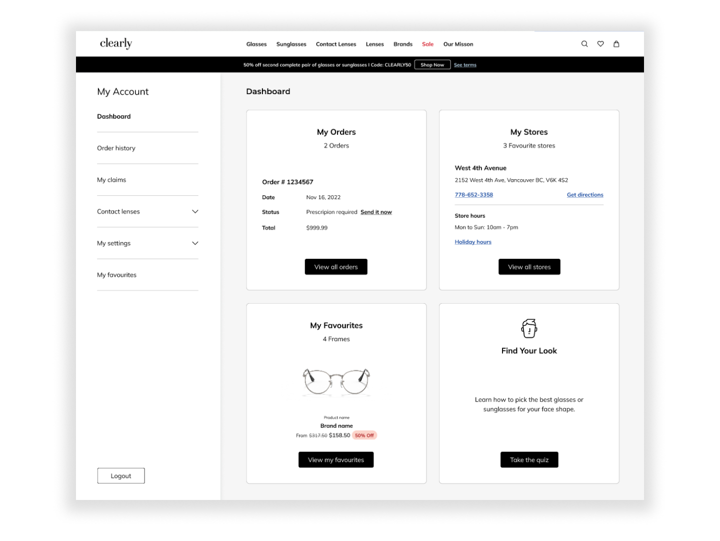
A new feature that users wanted to see to understand their account information quickly. I added microcopies to explain that they could access their order history, favourite styles, and more.
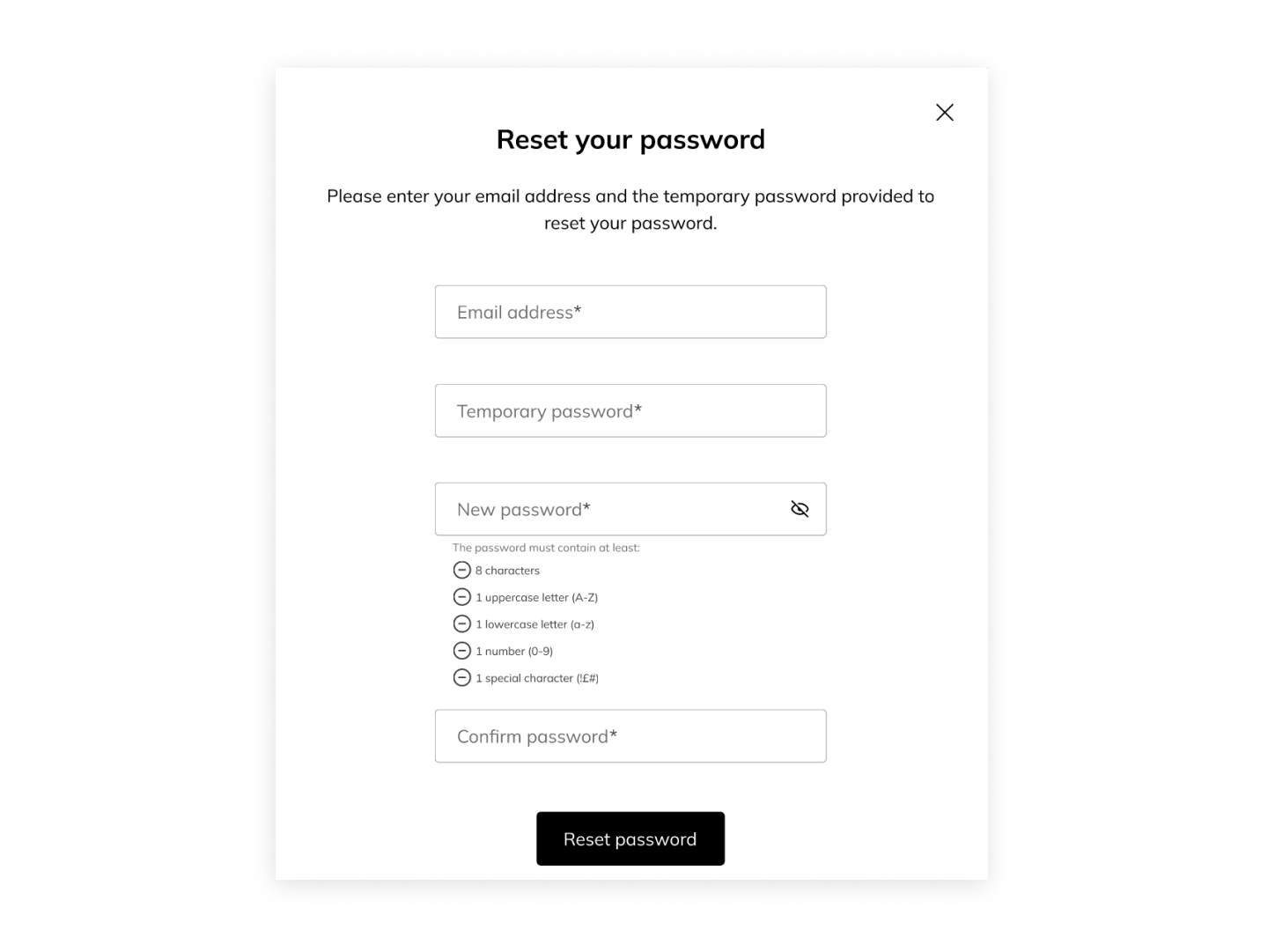
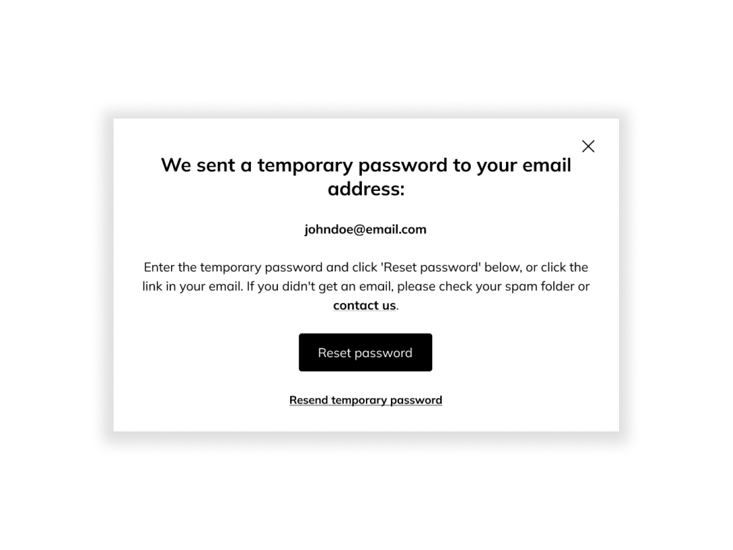
Based on feedback from multiple users, I added microcopies in an overlay confirmation message to capture users’ attention, ensuring they know they have completed their task.
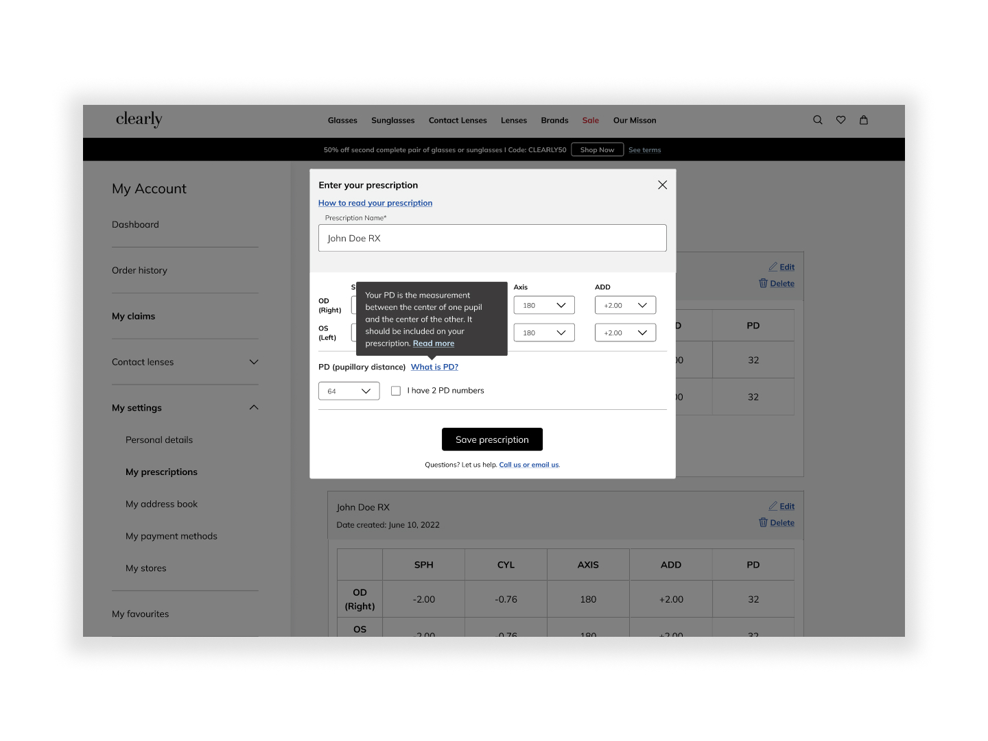
Several users weren’t sure how to add “PD” measurement to their glasses prescription. I added microcopies to explain what it is and where they can find it. To limit information overload, I shortened the copy within a tooltip and added a link to the company’s blog, which they could click on for further information.
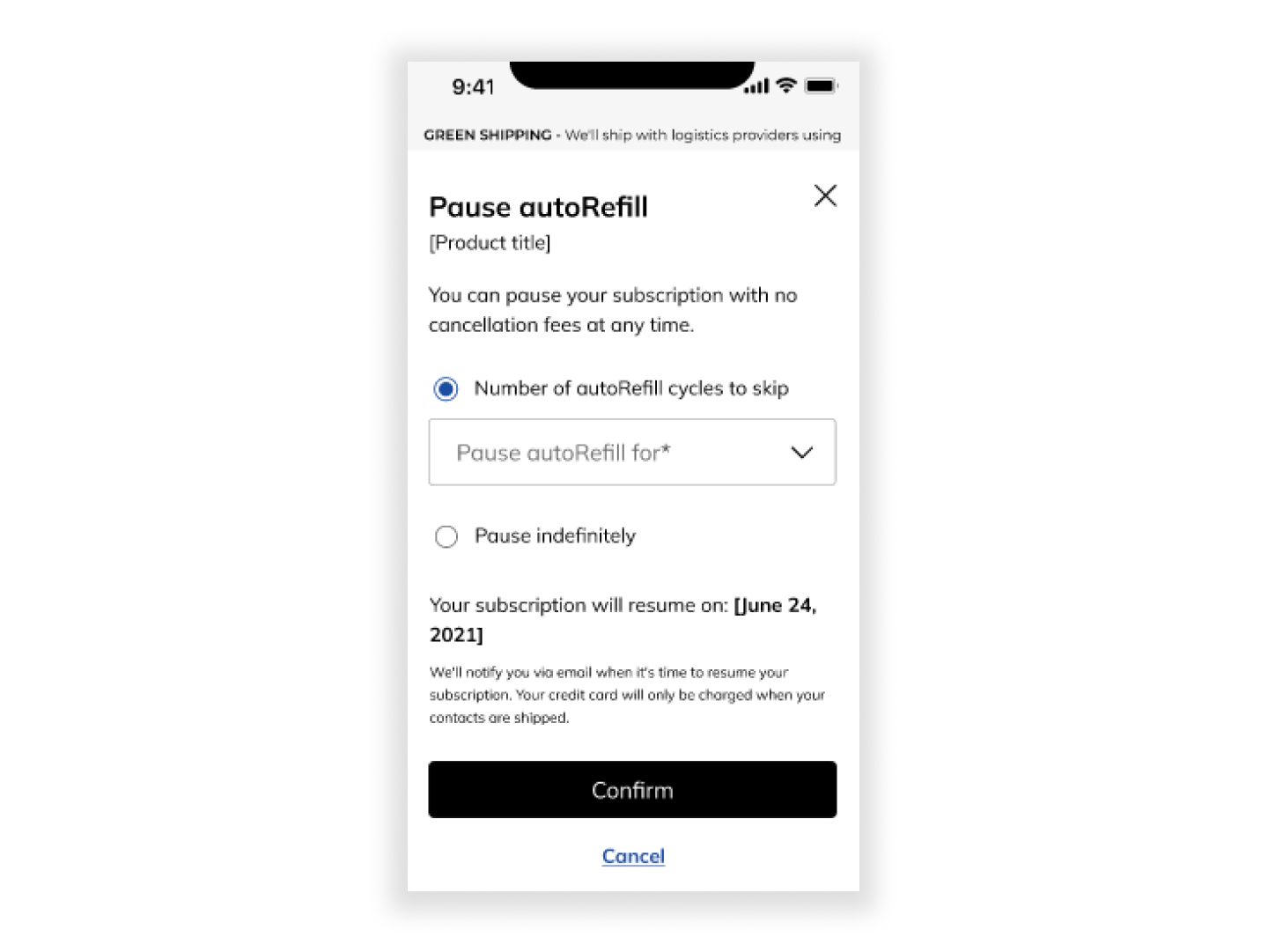
Users enjoyed the ability to pause their contact lens subscription at any time. By allowing them to choose from a range of frequencies, from “1 month” to “pause indefinitely”, they can find a frequency that keeps them engaged without becoming overwhelmed.
Users also wanted to see the resume date and know how payment works. I provided copies underneath which reassures them that they would receive a reminder email and their credit card won’t be misused.
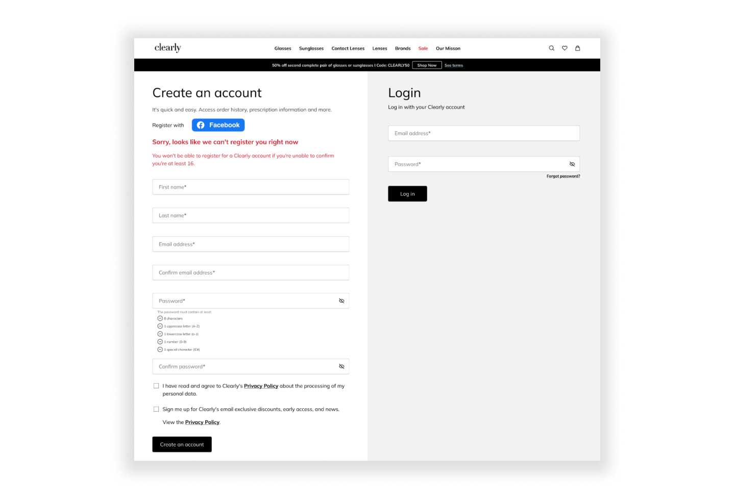
Using simple language to inform user about the problem, so that user is able to understand the reason for login failure and they can register for a Clearly account.
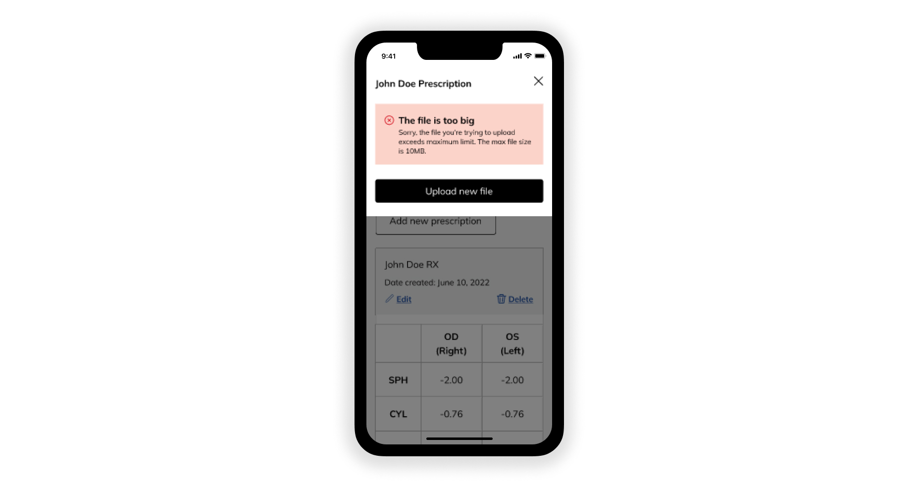
Whenever a user is faced with an error, they want to fix it as soon as possible. This error message intends to give direction to users and guide them on how to rectify the issue.
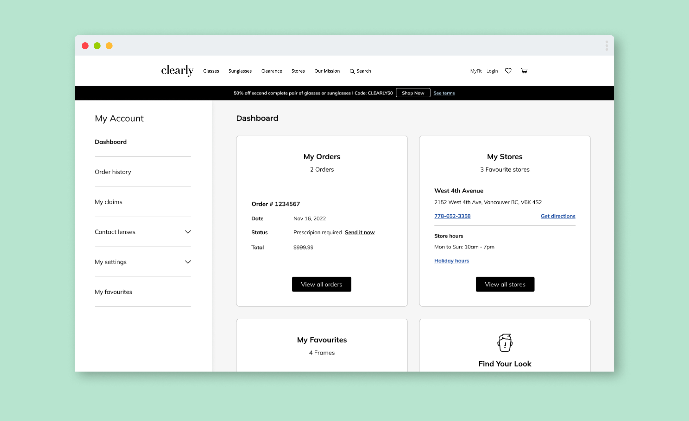

Users can now enjoy having a personalized experience on their account page, including placing orders, managing account details, creating wishlists, and modifying payment methods without disruption. The account page is optimized with the right features, and information is readily available to users anywhere when they return.
I enjoyed producing intuitive copies for both existing and new features within the account portal that streamlines the ordering and purchasing process, and increases the number of repeated purchases.
To review an in-depth selection of my work or to discuss working together, please get in touch: